KPI reporting is the practice of putting a chosen set of performance indicators in front of a named audience on a fixed cycle, so that every indicator supports a decision somebody is accountable for. A KPI report is what that practice produces. The test of one is whether anything happens after it is read.
Somewhere in your company there is a monthly report with eleven numbers on it. Air spend against budget. Advance purchase compliance. Online adoption. Average ticket price. Hotel attachment. It goes out on the fifth working day, the figures are right, and nobody has asked a question about it since March.
Nobody involved has done anything wrong. The report was assembled out of what the booking tool, the card file and the expense system can produce, which is a different question from what anyone in the room has to decide this month.
The money attached to it is not small. The Global Business Travel Association's 2026 Business Travel Index, published in August 2026, forecasts global business travel spending of $1.71 trillion this year across more than 1.84 billion trips. A programme owner answers for a slice of that every month, usually on one page.
A KPI report earns its place when every indicator on it belongs to somebody who can act on it. Most are built the other way round, from what the systems happen to measure, and that is why they get produced monthly and read never. What follows is a test you can run against your own report, worked through on a corporate travel programme because that is where the pattern shows most clearly.
In this article
- What is a KPI report?
- What does a good KPI report look like for a travel programme?
- Why do people stop reading KPI reports?
- Who is a KPI report actually for?
- What makes a KPI worth reporting?
- How many KPIs should a report have?
- Should a KPI report say what to do, or only what happened?
- How is a KPI report different from a screen that shows the same numbers?
- How do you rebuild a KPI report that nobody reads?
- Frequently asked questions
What is a KPI report?
A KPI report is a fixed set of performance indicators, presented to a named audience on a regular cycle, where each indicator has been chosen because a decision depends on it. What separates it from a data extract is that somebody has already decided what matters. What separates it from a live display is that it ends.
The word doing the work in "key performance indicator" is "key". Any number that moves when the business moves is a performance indicator, and a mid-sized company holds thousands. A key one would change somebody's behaviour if it moved far enough.
Robert Kaplan and David Norton set that distinction out in Harvard Business Review in January 1992, in the paper most reporting practice still descends from. Their warning has aged better than their diagram: they observed that "companies rarely suffer from having too few measures", and that the usual failure is adding one more whenever somebody makes a reasonable suggestion. The suggestion now arrives from a system rather than a consultant, and it arrives faster.
So the useful definition is a negative one. A KPI report is the document left over once you have taken off everything nobody is going to act on.
What does a good KPI report look like for a travel programme?
For a travel programme, a good KPI report is short enough to finish standing up and specific enough to start an argument. It names the two or three places where money or risk moved this month, it says who owns each one, and it states what would have to change for the number to move back.
Take the eleven-line report from the opening and put every line through two questions: who can change this number by doing their job, and what decision does it feed.
Five lines survive with an owner and a lever, two belong on a different cycle from the one they are published on, and nothing is lost by any of it, because the numbers stay in the systems that hold them. Removing an indicator feels like removing oversight. An indicator nobody acts on is a claim of oversight rather than the thing itself, and the claim is what fails when somebody asks a hard question about a route or a supplier.
Buyers describe this from the other end. A corporate travel buyer told Business Travel Executive in February 2023 that "Many travel managers know what data points they require, many of which aren't covered in the standard reports". The report is full and the required figure is missing, which is what happens when a page is assembled from availability.
Why do people stop reading KPI reports?
People stop reading a KPI report when it stops changing what they do. Four causes account for most of it: a report that repeats last month with different digits, indicators nobody owns, numbers with nothing to compare them against, and a cycle slow enough that the finding arrives after the decision has been taken.
The first three are fixable by whoever writes the report. The fourth is structural and does the most damage. A quarterly pack describes a quarter that closed weeks ago, so by the time it is read the sourcing round has started and the team that breached the rate cap in month one has breached it twice more. The report is accurate and too late to be interesting, which teaches its reader that reports are a record rather than a prompt.
Say this plainly: there is no reliable public figure for how many corporate reports go unread, and anyone quoting one is guessing. What can be said is structural. A document that has never once changed a decision has no evidence of usefulness behind it, however carefully it was built.
That is an argument about timing rather than content, and it is the case for executive reporting without a dashboard: a written monthly briefing that reaches its reader while the month it describes can still be argued with. Cadence does more for readership than layout ever will.
Who is a KPI report actually for?
A KPI report is for whoever will be asked to explain the numbers on it. That is usually one person rather than a distribution list. A report written for a list gets pitched at everyone's altitude at once, which leaves it answering nobody's question and safe for all of them to skip.
The audience question is an accountability question with a simple test. Ask who gets the phone call when a number looks wrong. That person is the reader, and everybody else is being kept informed, which is a different job and usually a worse one for a report to do.
Writing to one reader changes the document visibly. Indicators that reader cannot influence come off the page, indicators they will be challenged on move to the top, and the language stops explaining what a metric is. Two documents from one underlying run, pitched at two altitudes, beat one document trying to brief a board and supply an operational team at the same time.
The cheap version of that is one question about the circulation list. Find out which of the names on it have ever replied, asked something or passed the report on. Those people are the readers, and the rest are an audience the report acquired rather than chose.
What makes a KPI worth reporting?
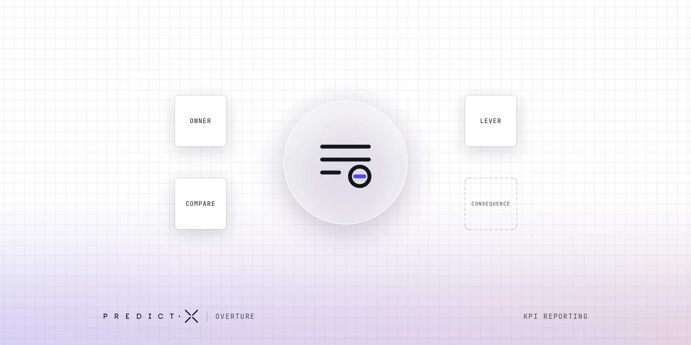
An indicator earns a place on a report when four things are true at once: somebody owns it, that person has a lever they could pull before the next report, a comparison says whether the number is good, and something changes if it stays where it is. Fail one of the four and it belongs in an appendix.
Call that the Subtraction Test, because it is run to take lines off a page rather than to justify the ones already there.
- An owner: a named person whose job includes moving this number. A department is not an owner.
- A lever: something that person could do before the next report, not a plan for next year.
- A comparison: a target, the previous period or an outside benchmark, so the figure can be judged rather than only read.
- A consequence: something that happens, or stops happening, if the number does not move.
Most indicators fail on the third and fourth rather than the first two. A compliance rate has an owner and arguably a lever, and it still tells nobody what to do, because the rate is not the finding. The reason behind it is.
Kerry Douglas, head of programme at the Institute of Travel Management, told The Business Travel Magazine in September 2025 that "travellers often believe they're saving the company money, not breaking policy". A report carrying the rate and not the reason hands its reader a number and keeps the decision.
Indicators that survive because they are cheap to produce and comfortable to look at are vanity metrics, and no page ever acquired one deliberately.
Does a KPI scorecard fix this?
It sets a target and a rating beside every indicator, which settles the third condition and part of the fourth. It does nothing about the first two, and a red rating on an indicator nobody owns produces an argument about the rating rather than a decision about the thing rated.
How many KPIs should a report have?
As many as there are people who would be asked to explain one, which on a single-owner programme usually lands between three and six on the front page. That is a working judgement rather than a measured finding. The limit is accountability rather than attention: a line with nobody attached adds length without adding a decision.
The page fills up because adding to it costs nothing. KPI tracking tools produce as many KPI metrics as anyone requests, and most KPI reporting grows by accumulation rather than by choice.
The number usually quoted back is seven, borrowed from George Miller's 1956 paper in Psychological Review on the limits of immediate recall. Miller was describing how many items a person can hold in mind in laboratory conditions, not how many lines belong on a monthly report. Stretching him into a design rule misuses a good paper.
The count that holds up is the one you could defend out loud. Go down the page and ask, for each line, who answers if the finance director raises it. Where the answer is nobody, the line is length.
Nothing has to be thrown away. An indicator that fails the Subtraction Test moves to an appendix that is available rather than presented. A front page is a claim about what mattered this month, an appendix is a record, and mixing the two turns the claim back into a list.
Should a KPI report say what to do, or only what happened?
It should say what happened, what that means and what the options are, and stop short of choosing. The decision belongs to whoever is accountable for it. The report's job is to make that decision cheap to take, which means carrying the reasoning and not only the conclusion.
There are three levels a report can stop at. The record states the figure. The read says what the figure means against its target and the period before it, and the recommendation says what somebody should now do about it.
Most stop at the record, which leaves the reading to whoever opens the document, and that person has the least time in the chain to do it. A conclusion the reader cannot audit has the opposite problem: it asks for trust rather than agreement.
So the useful answer is the middle level with the working attached. Name the options, show where each one came from, and let the reader disagree with the reading rather than with the report. Disagreement is a form of readership.
How is a KPI report different from a screen that shows the same numbers?
A report ends and a screen does not. A KPI report has been decided by somebody before it arrives: what is on it, what it is compared against and what it means. A screen leaves all three to whoever opens it, which is how the same numbers can be present and unread at the same time.
This is not an argument against the screen. Anything a person needs to interrogate or filter belongs on one, and a KPI dashboard is the right tool for a team working a question all week rather than reading a conclusion once a month. The difference is who does the deciding, and when.
The last row is the one that gets missed. A screen nobody opens shows up as a usage problem somebody eventually looks into, and a report nobody acts on shows up as nothing at all, because the file was still produced and still delivered on the fifth working day.
Choosing between the two is the wrong question. The useful one is which your reader was handed when what they needed was the other.
How do you rebuild a KPI report that nobody reads?
Start with the reader rather than the layout. Name the one person who is asked to explain the numbers, collect the questions they actually had to answer, run every line through the four conditions, put a comparison beside each survivor, and shorten the cycle before redesigning anything.
- Name the reader: one person, not a role and not the circulation list.
- Collect the questions they were asked: what reached that person over the last two quarters is the report's real specification, and it rarely resembles the contents.
- Run the Subtraction Test: every line, all four conditions, no exemption for lines that have always been there.
- Put a comparison beside every survivor: a number with nothing next to it can be noted but not judged.
- Shorten the cycle: a finding raised a month after it happened can still be argued with. A quarter later it is history.
Most rebuilds start at the wrong end. The redesign is the visible part, so it is the part that gets commissioned, and a better-looking report carrying the same eleven lines is the same report. Steps one and two cost a few conversations and no software, and done honestly they usually take half the page off at step three.
Frequently asked questions
What is a KPI dashboard?
A KPI dashboard is a live screen showing a chosen set of performance indicators, refreshed from the underlying systems and usually filterable. It answers "where do things stand now" for whoever opens it. It differs from a KPI report in that nobody has decided in advance what matters this period.
What is the difference between a KPI report and a KPI dashboard?
A KPI report is a fixed document addressed to a named reader, carrying a claim about a period that somebody has already made. A KPI dashboard is a live view leaving the selecting and the interpreting to the viewer. One ends, the other does not, and the two fail differently.
What should a KPI report include?
Every indicator with an owner, a lever available before the next report, a comparison to judge it by and a consequence if it does not move. Include what each figure means and the period it covers. Everything else belongs in an appendix, available on request rather than presented.
How do you create a KPI report?
Name the reader first, then collect the questions that reader has actually been asked. Choose only indicators passing those four conditions, put a comparison beside each one, say what every figure means and stop short of deciding. Publish on a cycle short enough that findings can still be argued with.
What do KPI dashboard examples usually get wrong?
Most published examples are judged on how they look and how much they show, which is a design question rather than a reporting one. They rarely name who owns each indicator or what decision it feeds. A layout cannot rescue numbers nobody is accountable for.
How often should a KPI report be produced?
Often enough that a finding is still worth acting on when it arrives. Monthly suits most travel programmes: short enough to catch a pattern in its first month, long enough to avoid reacting to noise. Quarterly reporting describes a period that closed weeks before anybody read it.
Before the next report goes out
The eleven-line report at the top of this article is not a failure of care. It is what happens when a page is assembled from what the systems can produce and then never tested against what anybody has to decide.
The test takes an afternoon. One reader, four conditions, a comparison beside every number that survives, and a cycle short enough that a finding is still worth arguing about when it lands. Better KPI reporting is not a longer page, it is a shorter one somebody answers.
Related Posts
What an executive dashboard is for, and the month it stops being opened
Why leadership does not fund your travel programme, and what executive buy-in turns on
Natural language generation: how to tell whether a report a machine wrote can be trusted