An executive dashboard is a single screen showing the small set of measures a leadership team has already agreed to watch, updated continuously so any of them can be checked at a glance. It answers whether a known number has moved. It does not decide which number matters this month.
Somewhere in your business intelligence tool there is a dashboard with the leadership team's name on it. It was specified across three or four meetings, built by somebody competent, and signed off in a session where everybody agreed it was the right set of numbers. Most of them are still the right set of numbers.
Now open the access log.
Two things are usually true at once. The dashboard was built well, and nobody at director level has opened it since March.
A corporate travel programme is a large number to leave unwatched. The Global Business Travel Association put global business travel spending at $1.71 trillion for 2026 across more than 1.84 billion trips, in its Business Travel Index published in August 2026. When a line item that size sits inside a business, somebody senior asks to see it, and a dashboard is the cheapest honest answer to that request.
In this article
- What is an executive dashboard?
- Why have an executive dashboard?
- What should be on an executive dashboard?
- What belongs on an executive dashboard for a corporate travel programme?
- What is the difference between an executive dashboard and an operational dashboard?
- What are executive dashboards bad at?
- Why do executives stop opening the dashboard after the first quarter?
- How do you build an executive dashboard?
- How often should an executive dashboard be refreshed?
- Does an executive dashboard replace a written report?
- Frequently asked questions
What is an executive dashboard?
An executive dashboard is a fixed, high-altitude view of a business or a programme, built around a handful of measures chosen in advance and refreshed automatically. Its purpose is monitoring: confirming at a glance that a number a leadership team already cares about is where it should be.
The word doing the work there is monitoring, and it is not ours. Stephen Few, whose Information Dashboard Design (O'Reilly Media, 2006) is the book most dashboard design still traces back to, defined a dashboard as a visual display of the most important information needed to achieve one or more objectives, consolidated and arranged on a single screen so the information can be monitored at a glance.
Two conditions sit inside that definition and both matter later. The objectives are already known. The information has already been chosen.
An executive dashboard, then, is the answer to a question somebody asked before the screen was built. Everything it is good at follows from that, and so does everything it is bad at.
Why have an executive dashboard?
Because a dashboard settles factual questions faster and more cheaply than a person can. It holds the agreed definition of every measure, ends disputes about what a number is, makes performance visible to the people being measured, and gives an analyst somewhere to start. None of that is trivial and nothing else replaces it.
Two of those deserve more than a clause. Half the value of any reporting build is the fortnight spent agreeing what counts as a booking, what counts as a breach and which cost centre owns a trip. The dashboard is where that agreement is kept, and once it is kept there, two people who disagree about whether air spend is up settle it in eight seconds without either of them having to be right in front of colleagues.
The second is quieter. A figure on a shared screen changes behaviour before anybody acts on it, because teams manage what their director can see. That effect is usually credited to policy and usually produced by visibility.
A travel programme that cannot answer "where is spend against budget" in under a minute has a problem no briefing will fix. Build the dashboard.
What should be on an executive dashboard?
Only measures a leadership team would act on, and few enough to read on one screen without scrolling. In practice that is between six and ten. Every measure should carry a comparison beside it, a target or the same period last year, because a number on its own cannot be read.
One test settles most arguments about inclusion: can somebody in that room change this number? If nobody present has authority over it, it is context rather than a control, and context belongs underneath the screen.
Six to ten is a working number rather than a finding. Nobody has published a defensible study on the right count, and any figure quoted at you is somebody's preference wearing a lab coat.
The comparison rule is firmer. An average ticket price of £412 means nothing on its own and a great deal beside £377 for the same quarter last year.
What belongs on an executive dashboard for a corporate travel programme?
Six measures cover most of what a travel programme's leadership needs to monitor: spend against budget, trip and traveller volume, average ticket price, booking lead time, online booking adoption and hotel attachment rate. Together they answer whether the programme is inside its envelope and behaving as designed.
The third column is the one no vendor gallery prints.
Every measure there is worth watching, and not one of them carries its own explanation. Fares move for reasons that have nothing to do with your policy, hotel rates move with the market you are buying in, and a fall in average ticket price can mean your travellers booked earlier or that the routes simply got cheaper.
Without market context sitting beside the internal number, a good month and a lucky month look identical.
What is the difference between an executive dashboard and an operational dashboard?
An executive dashboard is fixed, small and read at a glance to confirm status. An operational dashboard is filterable, granular and worked to find a cause. The first is built for somebody with twenty minutes and no intention of drilling. The second is built for somebody whose job is to drill.
The most common build error is one screen asked to be both. Add filters to the executive view and it becomes an operational view carrying too few measures to work with; strip them out of the operational view and the analyst goes back to writing queries by hand.
Both views can run off the same data. They should not run off the same layout, because only one of those readers arrived with a question.
What are executive dashboards bad at?
Three things: telling you which measure deserves attention this month, explaining why a number moved, and saying what should be done about it. A dashboard reports the state of measures somebody chose in advance. Judgement about what matters now sits outside the screen, with whoever is looking at it.
That is a property of the format rather than a fault in any particular build. A dashboard is an interface, and an interface needs an operator. An executive is not an operator of the travel programme's data; they are the person who decides what to do about it.
So the screen hands its reader four jobs on arrival: read the measures, work out which one is unusual, find out why, and decide what happens next. Three of those four are analysis. The dashboard does the first one.
Leandro DalleMule and Thomas H. Davenport reported in Harvard Business Review in May 2017 that less than half of an organisation's structured data is actively used in making decisions. Availability was never the constraint.
The concession usually offered by the people who sell dashboards is maintenance: a dashboard that starts strong loses relevance if nobody keeps it current. That is true and it is the smaller half of the problem. A perfectly maintained dashboard hands its reader the same four jobs on the first of every month.
Why do executives stop opening the dashboard after the first quarter?
Because the screen stops carrying new information while the programme carries on producing it. By month three the numbers are familiar, the ones that moved were not the ones chosen at build time, and the reader gets a faster answer by asking a person. The dashboard is replaced by a request.
The sequence is the same almost everywhere.
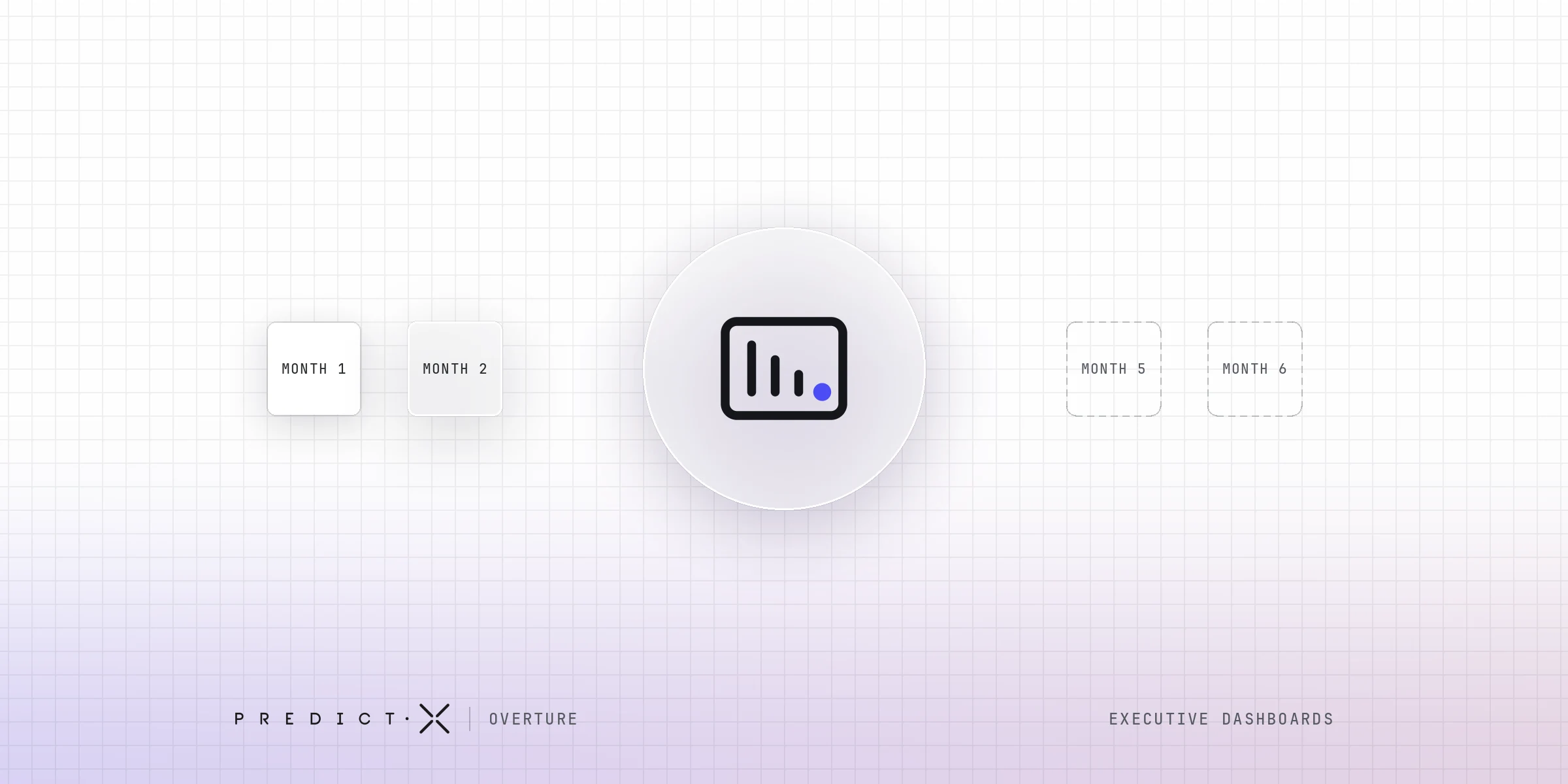
Month one, everything on the screen is unfamiliar, so everything is worth looking at. Month two, the numbers are familiar, and opening the dashboard confirms what the reader already believed.
Month three, something in the programme changes, and it is not one of the eight things chosen at build time, so it is not on the screen. Month four, the executive asks somebody.
Nobody in that sequence did anything wrong. The screen was doing its job throughout, and its job was never to work out which of those months needed attention.
What replaced the dashboard is worth pricing. "Can somebody pull this for me" costs an analyst two days, arrives after the meeting it was wanted for, and produces a spreadsheet nobody else opens.
There is also a reason the reader will not do the analysis themselves. Microsoft's Work Trend Index Annual Report, published on 9 May 2023 and drawn from a survey of 31,000 people across 31 countries, found that 68% said they did not have enough uninterrupted focus time during the working day. A dashboard assumes a quiet twenty minutes and a reader willing to spend them comparing tiles.
The Dashboard Half-Life Check
You can settle this on your own logs in about forty minutes.
- Pull the access log for the executive view for the last six months, by user and by month. Every business intelligence tool keeps one, usually under usage, audit or activity.
- Count distinct users at director level and above, per month. Count people, not sessions. One person opening it forty times in a fortnight is one user.
- Put month six beside month one.
- Separately, write down the decisions your leadership team took about the travel programme over those six months. Supplier moves, policy changes, budget calls, approvals tightened or loosened.
- Mark which of those decisions started on that screen.
Step five is the one that matters. A falling line in step three tells you the dashboard is opened less than it was. A short list in step five tells you what it was doing while it was still being opened.
There is no published benchmark to compare your ratio against, and we are not going to invent one for you. The comparison that means something is your own second reading, six months from now, after you have changed something.
How do you build an executive dashboard?
Start with the decisions rather than the data. Write down the four or five calls this leadership team makes each year, work backwards to the measures that inform them, then check that somebody in the room can change each one. Build the screen last. Most dashboards are built in the opposite order.
A travel programme's leadership makes about four real decisions a year: the air and hotel negotiation, a policy change, the budget call, and whether to consolidate suppliers. Each has a season. A measure that feeds none of the four is decoration.
Of those four, the budget call is the only one a programme owner has to bring to leadership rather than wait for. A monitoring screen is a poor instrument for that, because getting leadership to fund the change needs evidence somebody assembled on purpose.
The half of the build that gets skipped is the sentence beside each measure saying what happens if it moves the wrong way. Where the honest answer is "ask somebody to look into it", that measure belongs on the operational view.
How often should an executive dashboard be refreshed?
As often as the decisions it supports get taken, which for most travel programmes is monthly. Refreshing an executive view hourly produces movement rather than news. The refresh rate should match the decision rate, and the operational view underneath it can run as fresh as the data allows.
Travel data arrives on its own clock. Card feeds settle over days, agency files land weekly, expense closes at month end, and a trip booked in March can still change its cost in May. An hourly refresh on top of that shows an unreconciled number with a confident face on it.
A screen that changes every hour trains its reader to treat every change as noise, which is the correct response until the month it is not.
Does an executive dashboard replace a written report?
No, and neither replaces the other. A dashboard answers a question you brought to it. A written briefing brings you the question, because somebody, or something, has already looked at the month and decided what is worth your attention. Most programmes need both, doing different jobs.
That division is the whole argument here, and it is where executive reporting for a travel programme does the work a screen cannot. A written briefing arrives having already chosen. It names what changed, says what it is likely to have cost, and points at one thing to do about it.
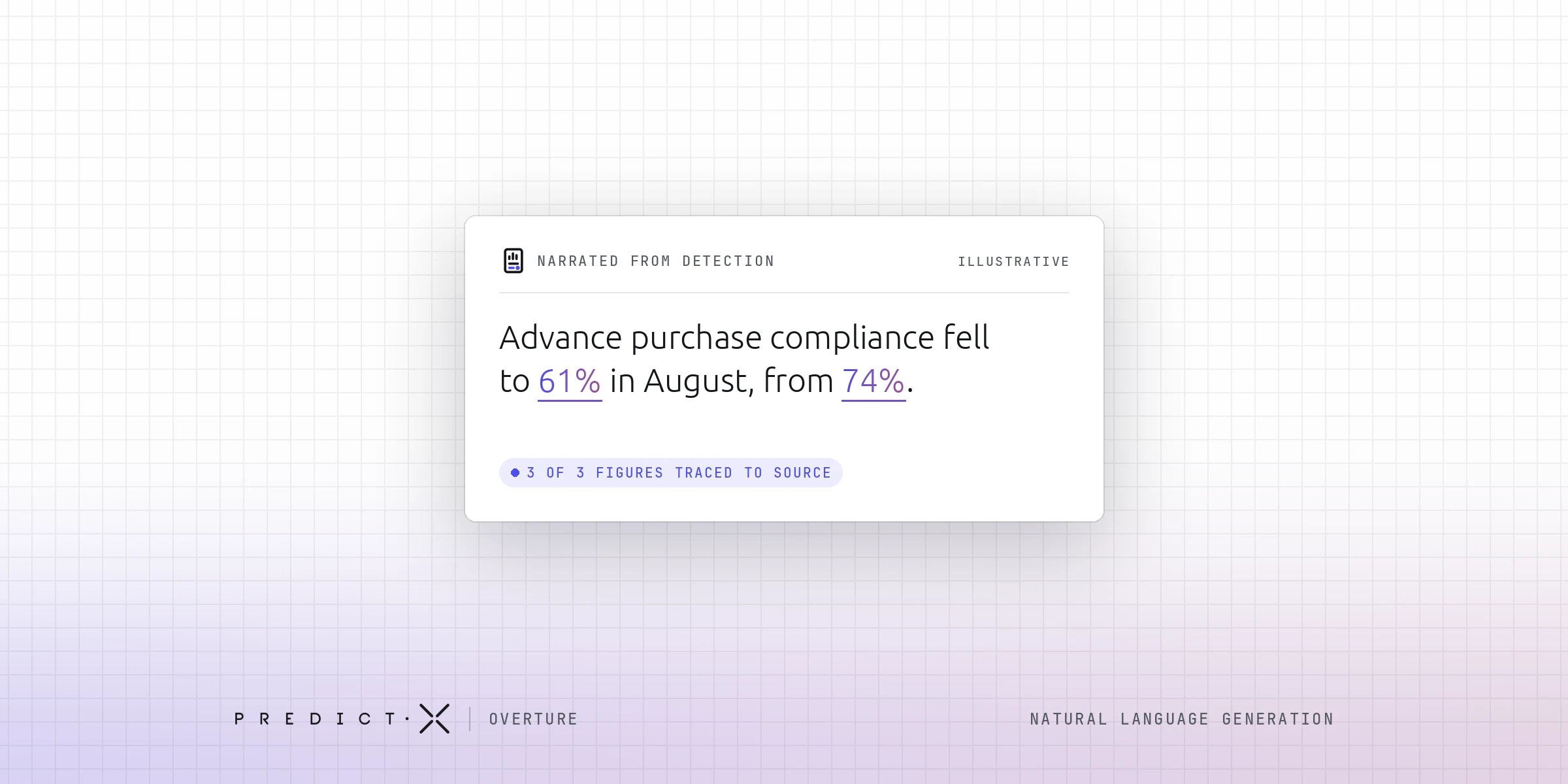
PredictX built Overture to produce that briefing monthly, and the mechanism matters more than the output. Detection is deterministic and happens at the warehouse: fixed rules, run over the programme's own data, finding what moved. The language model narrates what detection already found, does not find anything itself, and cannot report something the detection run did not produce.
The limits are part of the design. Overture is not real time: the briefing's numbers and its narration are generated together at each refresh and cached, so the words match the figures printed beside them. It does not rebuild or replace your dashboards, the briefing does not filter, and it is newly announced, so it carries no deployment history you can go and check.
Keep the dashboard for the numbers you already decided to watch. The briefing is for the month somebody should have told you something.
Frequently asked questions
What are executive dashboard best practices?
Keep it to one screen, give every number a comparison beside it, remove any measure nobody in the room can change, and write down what you will do if each one moves the wrong way. Then check the access log twice a year and cut what nobody opens.
How many metrics should an executive dashboard show?
Between six and ten. The constraint is reading time: a director gives the screen a few seconds per measure, so anything needing study belongs on the operational view. If a measure has never once been discussed in a meeting, remove it and see whether anybody asks.
Who should own the executive dashboard inside the business?
One named person who attends the meeting where it is used, usually the travel manager or the finance business partner for travel. Ownership by a central reporting team produces a screen nobody defends. The owner's job is to remove measures, and a rising count is the first sign of drift.
What do executive dashboard examples have in common?
Most published executive dashboard examples share three features: fewer than a dozen measures, a comparison against target or prior period on every one, and no filters. Copying one wholesale is how dashboards die, because those measures were chosen for somebody else's decisions rather than yours.
What is an executive reporting dashboard?
The same artefact under a different name: a fixed screen of leadership-level measures, sometimes with a scheduled export attached so a copy lands in an inbox on Monday. The export is a picture of the screen, and it still needs a reader who knows which number to read first.
Can an executive dashboard explain why a number moved?
Not on its own. A dashboard shows that average ticket price rose. The cause sits in the bookings underneath, in the market you were buying in, or in one team changing how it books, and finding it means somebody going to look.
How do you know whether your executive dashboard is still being used?
Pull the access log for the last six months and count distinct director-level users per month, not sessions. Then list the decisions your leadership team took in that period and mark which of them started on the screen. The second list is the honest measure.
What a monthly briefing does with the same data
Overture reads the same programme data your travel dashboard reads, then writes the month up: what changed, what it is likely to have cost, and the one thing worth doing about it. It arrives on the first of the month without anybody preparing it.
Related Posts
Why leadership does not fund your travel programme, and what executive buy-in turns on
Natural language generation: how to tell whether a report a machine wrote can be trusted
KPI reporting: what a KPI report is for, and why most of them go unread